Wildfire activities in Australia
*20-jul-2025*
python
#Import Libraries
import numpy as np
import pandas as pd
import matplotlib.pyplot as plt
import seaborn as sns
import folium
%matplotlib inline
import datetime as dt
python
#import csv into pandas dataframe
url = "https://cf-courses-data.s3.us.cloud-object-storage.appdomain.cloud/IBMDeveloperSkillsNetwork-DV0101EN-SkillsNetwork/Data%20Files/Historical_Wildfires.csv"
df = pd.read_csv(url)

# show top 5 rows
df.head(5)

#create 2 fields with year and month from date
df['Year'] = pd.to_datetime(df['Date']).dt.year
df['Month'] = pd.to_datetime(df['Date']).dt.month

#create new field with an average of 'estimated fire arena' by year
mean_of_est_fire_arena = df.groupby('Year') ['Estimated_fire_area'].mean()
#reset index
mean_of_est_fire_arena.reset_index()

#merge the average into original table by year
df = df.merge(mean_of_est_fire_arena, on = 'Year', how = 'left')
# replace the name of the column to 'mean_of_est_fire_arena'
df.rename(columns={'Estimated_fire_area_y':'mean_of_est_fire_arena'},inplace= True) 1 / 13
python
plt.figure(figsize=(12,6))
plt.plot(mean_of_est_fire_arena['Year'],mean_of_est_fire_arena['Estimated_fire_area'],color = 'darkred')
plt.xlabel('Years')
plt.ylabel('Average estimated Fire Arena(km²)')
plt.title('Estimated Fire arena over time',fontsize = 14)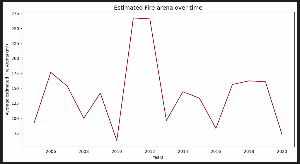 2 / 13
python
#make the average of 'estimated fire area' and  group it by Year and month
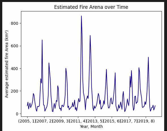
df_new = df.groupby(['Year','Month'])['Estimated_fire_area_x'].mean()

#plot the data
df_new.plot(x=df_new.index,y= df_new.values,color= 'darkblue')
plt.xlabel('Year, Month')
plt.ylabel('Average estimated fire Area (km²)')
plt.title('Estimated Fire Arena over Time')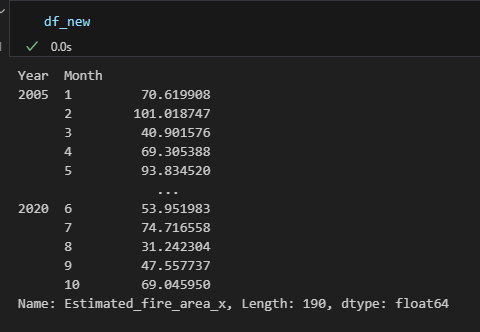 3 / 13
 4 / 13
python
# Plot the distribution of mean for Fire Brightness using Seaborn
plt.figure(figsize=(10,6))

sns.barplot(data= df, x = 'Region', y = 'Mean_estimated_fire_brightness',color='darkgreen')
plt.title('Distribution of Mean Estimated Fire Brightness across Regions')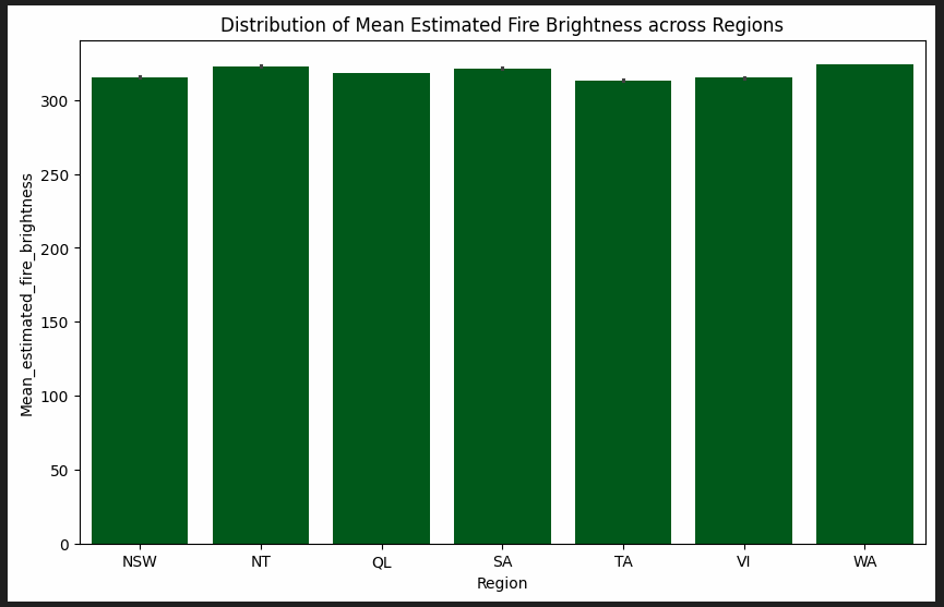 5 / 13
python
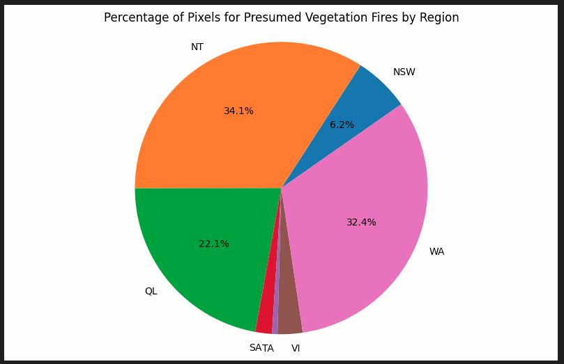
# Portion of count of pixels for presumed vegetation fires vary across regions
df_count = df.groupby('Region') ['Count'].sum()
df_count

#a function to hide pie labels < 6%
def atopct_hide(pct):
    return f'{pct:.1f}%' if pct >=6 else ''

#plot the pie chart
plt.figure(figsize=(10,6))
plt.pie(df_count['Count'],labels=df_count['Region'],autopct=atopct_hide,startangle=35)
plt.title('Percentage of Pixels for Presumed Vegetation Fires by Region')
plt.axis('equal')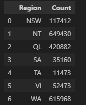 6 / 13
 7 / 13
python
plt.Figure(figsize=(10,6))
#Distribution of "mean estimated fire Brightness"
plt.hist(x = df['Mean_estimated_fire_brightness'],bins=20,edgecolor = 'darkblue')
plt.title("Histogram of Mean Estimated Fire Brightness")
plt.xlabel('Mean Estimated Fire Brightness (Kelvin)')
plt.ylabel('Count')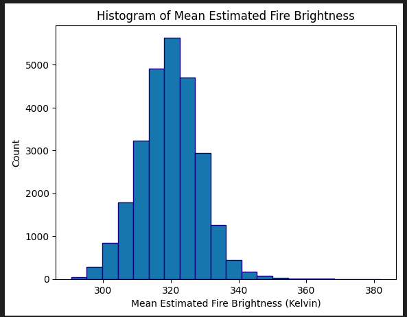 8 / 13
---
python
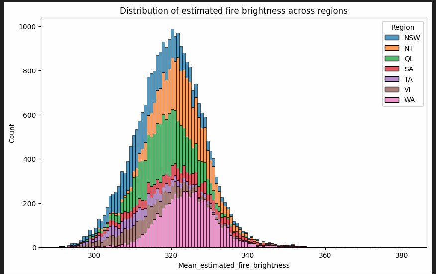
# distribution of "estimated fire brightness" across Regions using Seaborn
sns.histplot(data=df, x='Mean_estimated_fire_brightness', hue='Region',multiple='stack')
plt.title ('Distribution of estimated fire brightness across regions')
plt.show()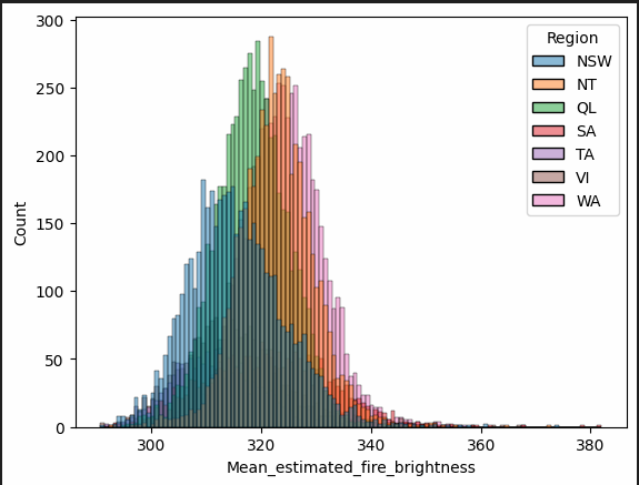 9 / 13
 10 / 13
---
****
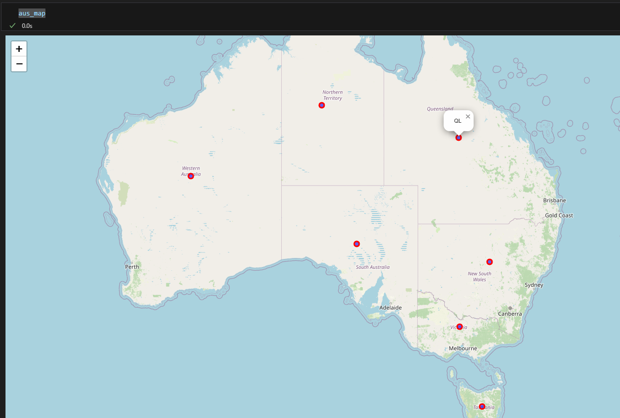
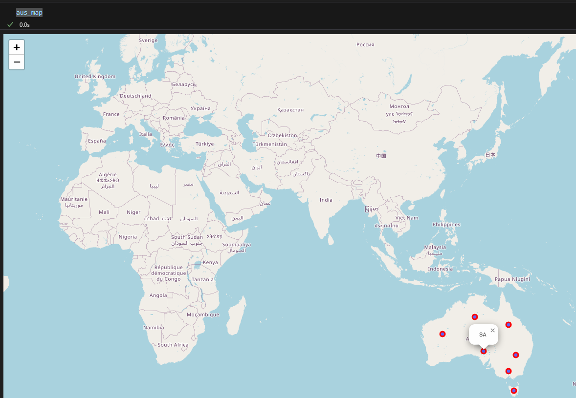
**Mark seven regions on the Map of Australia using Folium**
python
plt.figure(figsize=(10,6))
sns.scatterplot(data=df, x='Mean_confidence',y='Mean_estimated_fire_radiative_power')

plt.title('Mean Estimated Fire Radiative Power vs. Mean Confidence')
plt.xlabel('Mean Confidence')
plt.ylabel('Mean Estimated Fire Radiative Power (MW)')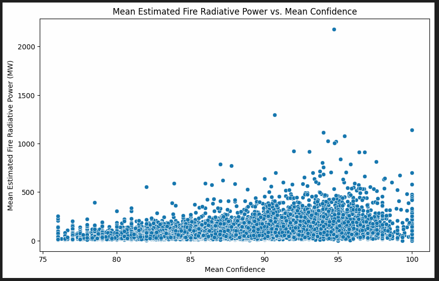 11 / 13
python
##  Initializes an empty feature group aus_reg to hold all the map markers.
aus_reg = folium.map.FeatureGroup()

## Creates a folium.Map centered on Australia
aus_map = folium.Map(location=[-25,135],zoom_start=5)

for lat,lng, lab in zip(reg.Lat,reg.Lon,reg.region):  #loop and pull: lat,lng and lab(aferent val)
    aus_reg.add_child(
        folium.features.CircleMarker(    ## For each location, it creates a CircleMarker:
            [lat,lng],                   #  place circle at [lat] [lng]
            popup=lab,                   #  popup=lab: shows the region name when clicked
            radius=5,
            color = 'red',
            fill= True,
            fill_color = 'blue',
            fill_opacity = 0.6
        )
    )

#add the feature group to the map
aus_map.add_child(aus_reg)
#show map
aus_map
 12 / 13
 13 / 13